Tuesday 28 October 2014

WOLVERINE: UNUSED MARVEL COVER #5


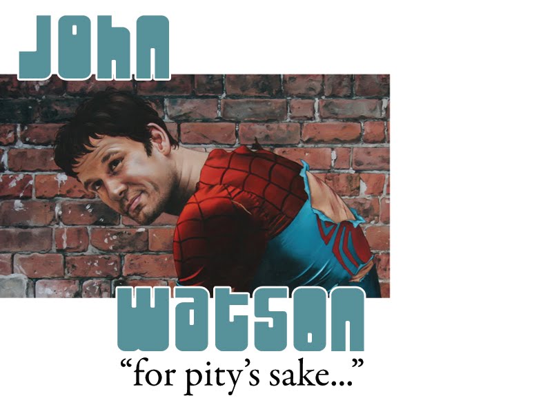
I remember there was a massive issue with the prelim for this piece as it looked a little like Hugh Jackman. So I tried to make Wolverine look more like the Frank Quitely version. When I was working for Marvel there was a memo that went out to all creators on a regular basis explaining how we couldn't use likenesses in any of the art we did. Fair enough. I think the only time I did was when I used the movie J Jonah Jameson on the cover of Civil War Frontline #2 and it was no big deal. 

There was an artist who did use likenesses though, to a ridiculous degree. In fact he traced photos of celebrities, models and even other artists work. He irks me...

So, which Wolverine artist do I think is the best? I'd go with John Byrne. He added a lot to Cockrum's Wolverine, tweaked the look and perfected it. I still think Claremont and Byrne's X-Men is the best run of the title ever. It's good to read today 40 years on...Byrne drew a lot of them definitively, Colossus, Phoenix, Wolverine, Cyclops, Banshee, Storm...I'd take Alan Davis' Nightcrawler and Kitty Pryde over Byrne though.

If you think of classic, iconic images of Wolverine, then you think of a John Byrne drawn image.

I thik my attempt at a Wolverine cover was ok...some of the anatomy work is alright, the detail in the jeans is pretty good, I should have loosened up a little though...And the background trees are too sparse.
Monday 27 October 2014

THOR: UNUSED MARVEL COVER #4

And here's my Thor cover...I guess if this one hasn't been used yet then it's a bit dated now, Loki isn't a woman anymore!


I painted this a little differently from how I usually work. I painted an initial bright underpainting in oranges, reds and deep browns, kept it loose, and then worked the sky into that. Then I painted the figures in over the top, leaving the oranges showing through in many places. I actually had a broken hand when I painted this...I'd take the brace off and very carefully place my hand on the board and slowly paint as carefully as I could.

There've been some magnificent Thor artists over the years. But I think the thing for me is whether an artist can capture the scope of Asgard, the massive tapestry of the world Thor exists in. Very few can. Kirby, obviously, his Thor was some of his top work. Next would be John Buscema, such an underrated artist, his Thor had the gravitas that Kirby's did. It was his ability to show both the small incidents within the enormous mythical setting and the incredible, earth shaking battles and conflicts that set him apart from most of the artists who followed Jack Kirby.

The next artist to attain that level was Walt Simonson...man, he fit so much into that title, Beta Ray Bill, some of the covers are incredible.

And I think the last artist to get the grand scale right was Olivier Coipel. From the slow town cafe characters to the monumental buildings of Asgard...he got it right. And Thor had the right size and bulk too...not just an overmuscled hippy like too many draw him. He looked Norse too, European at least.

I may add Alan Davis into the mix too. I saw an issue of prelims that he'd done for an issue of Thor that blew me away. It felt like Kirby...it's exciting to think there's an issue out there that could be that good that I've not seen yet...

Sunday 26 October 2014

CAPTAIN AMERICA COVER:UNUSED MARVEL COVER #3

Here's a World War 2 piece. I've always enjoyed painting Captain America with his uniform battle damaged. I wanted a bleak image so I toned down or muted the colours to a certain degree and I tried to keep the piece loose as well, get a sense of movement in there...
I may have failed with the movement. It turned out to be a pretty patriotic image...


After chatting a little about my favourite version of Spidey in a recent post I may as well throw a few thoughts down about my favourite Captain America artists. I really like Alex Schomburg's Cap. His covers in the Golden Age were everything that Captain America should be, drawn at a time when Cap was at his peak, his most relevant, during World War 2. I'd also throw Syd Shores in there as well...I actually think Norman Rockwell would have been the ideal artist for Captain America, or JC Leyendecker, I'd have loved to have seen their depiction of him...imagine a series of Saturday Evening Post covers by Rockwell, some showing Cap with the troops, some showing Steve Rogers' life in the army. 

Of the post thaw Cap, I do like the Bryan Hitch version, but that may be down to the writing more than anything. I really enjoyed the Millar/Hitch Ultimates...I think they did the man out of time thing in a realistic manner...


Saturday 25 October 2014

SPIDER-MAN COVER: UNUSED MARVEL COVER #2, MUSINGS ON ROMITA SR. AND MORE

Here's another stock cover I did for Marvel a few years back. One thing that works on this piece is the lighting in the sky, I think I caught the look of twilight over a city pretty well.


 I went for a Romita Sr. Spidey for this cover, a little chunkier than others draw him. Romita Sr. is the definitive Spider-Man artist in my opinion. I read Spider-Man weekly as a kid, British b/w reprints of the American Marvels. But I was never really a Marvel Comics reader, it was all DC. 
I did look at the odd issue, I had a friend at school who read all Marvel and no DC, we recommended titles to each other once in a while. I did buy Excalibur, the only Marvel title I ever reserved each month...it was the covers that drew me into that series, really clever and funny. But, on the whole, I never read Marvel...there is a point to this, it's not just a pointless tangent, bear with me...

By 1994/5 I'd stopped buying comics, it'd started in late 1991, was exacerbated by my internship at DC comics in Jan/Feb 1992*

I left collage and started my first job in the design field. I realised that I wasn't good enough, quit, and enrolled on a foundation art course, paid my fees and learned to draw. I got into painting, fine art, French Romantics, Rembrandt.,,and left comics behind.

One weekend, on my way home from University I had a few hours to kill inbetween train connections in Birmingham, and came across a comic book shop. I saw an issue of the Flash with Quicksilver on the cover (well, he was called Max Mercury now), the old Quality Comics character. I bought it and it was good. Mark Waid was the writer. I went back and bought some other issues. On the way back to the train I came across a second hand book store with comics in the window...they had old British Marvel comics, all in b/w for 5p each. I filled my rucksack. And I was introduced to John Romita Sr. 

And this is the point really, I first saw his art as an adult and it was very different from seeing an artist for the first time as a kid. I was now educated about art, I didn't rate an artist because they were drawing my favourite character...and Romita blew me away. Deceptively simple, beautiful characters, stylised to a point, dynamic storytelling. As I stated near the beginning of this blog, the best Spidey artist. Ditko, I like what he did, but I prefer Romita. Love the Gil Kane Spidey, probably put him second, Andru and Esposito, maybe I'm biased because that's the Spidey I read as a kid...but it's a great incarnation. 

If you've never read the classic Romita/Lee Spidey then give it a shot, in an older paperback or collected edition if possible to avoid the inevitable garish and uncomplimentary digital recolouring...


A page from Spidey #50. An image used in the movie and in countless comics since


I include this cover as I actually did a painting of it as part of my degree show at University. It was 8ft by 6ft and had me as Peter Parker (some things never change)...last I heard it was still hanging in the University dining room. I may have a photo of it somewhere...

A the same time I discovered Neal Adams' Marvel work, John Buscema, Walt Simonson's X-Factor and Thor and the Byrne/Claremont X-Men...I'll talk about all that another time.


*I've mentioned this before to a few people. In late '91 I was in the final year of my HND in graphic design and it was time to sort out a work placement, or internship, at a company, a local design or advertising agency ideally. I hated the course by that point. I'd enjoyed the OND and figured the HND would be more of the same. It wasn't. Anyway, I applied to Marvel Comics, DC Comics, Marvel Uk etc, you get the picture. And DC wrote back to say that if I could cover my own expenses then they'd be happy to let me do my work placement there, in New York. So I got my 21st money early and funded the trip. I'd never been away before on my own, never flown anywhere. I was naive and clueless. The Y on 41st and Vanderbilt was where I'd be staying...it was pretty terrifying. I stayed one night, a bloke asked if I wanted to come to his room. There was no hot water in the communal showers...you get the picture...

During my first day at DC I was approached by Eric Kachelhoffer who asked if I'd like to stay with his family (as the Y wasn't the ideal place for me to be). I jumped at the chance. For the next 2 months I lived in Mineola on Long Island and got the train to Manhattan each day with Eric and sometimes Bob Rozakis (The Answer Man) who I was working under for the most part, during my time at the company.

I worked with some really talented and interesting people at DC, John Wren, who'd worked at Charlton with Giordano, Ditko and Aparo. Bob LeRose who'd worked with Lou Fine and Neal Adams at Johnstone and Cushing back in the early 60's. I basically settled into a working life at DC, never doing anything touristy at all. 

It was a great couple of months. I was shifted around a little, one day I'd be photographing artwork for reproduction or the archives another I'd be commanding the switchboard. I also got to go through two or three longdraws of original art and send it back to the artists. Brian Bolland Animal Man and Wonder Woman, Bisley Lobo, even a Don Newton Batman splash was hiding in there, must have been there for at least 7 years...I got to meet Murphy Anderson too, a really humble, guy, and a brilliant artist.

But I think seeing the struggles of the staff, the low morale, a lot of negative things really, talented people who were at breaking point after being beaten down for years...it was a different side to the 'wouldn't it be awesome to work in comics' dream. And also, comics themselves just weren't as good as they used to be. Had I grown up or outgrown comics? Nah, I just don't think they were as good as they had been, Anyway, I stopped reading comics.


Friday 24 October 2014

FANTASTIC FOUR COVER

When I was coming to the end of my contract at Marvel I was asked to do a few paintings that could be used when a cover was needed in a hurry. So they had to be pretty generic and able to be slapped on any issue, no matter the content.

Here's the first one I did, of Johnny Storm. I have no idea if it's ever been used. If anyone knows whether it has been or not then let me know! Technically I'm not supposed to show any art that hasn't been published...but it's been about 5 years since I did this piece so I don't think there'll be any issues...


I thought this was pretty good when I painted it, and I think it is now, which is unusual as I hate everything I draw or paint immediately upon completion.

Someone I showed it to said it looked like the cover for Kamandi #1. I'd never seen that cover so I checked it out. The Statue of Liberty appears on Kamandi #1...but that's the only similarity. Sometimes a cover can look cool without having been ripped off another cover.

I like the juxtaposition of the hot colours of the Torch against the greens and blues of the background. 

Wednesday 22 October 2014

ADVENTURE COMICS #14: ULTRA BOY AND THE LEGION OF CRIME CHAPTER 4

ADVENTURE COMICS #14


In this issue the Legion of Crime break their incarcerated teammates out of prison. Element Emperor isn't a very nice man really...

Again, not had chance to colour this one yet but I eventually hope to have time to colour the whole series. I did this piece before I figured out something about inking whilst looking through Barry Kitson's art at the NICE convention last month.

This series will run about 20 issues. When it's finished I'll be getting a collection published that'll have a lot more information about what would have been the content for each issue, sketches, unused covers (I've binned one off this week, issue 16, I inked it and then realised I didn't like anything about it!) thumnails...I'm open to ideas about what I should use as the cover image!

Wednesday 8 October 2014

L.S.C.C. 2015

LONDON SUPER COMIC CON MARCH 14/15 2015


I'll be attending LSCC again next year. I'll add more information as it becomes available. I can say for certain that I'll be taking commissions and that I'll be doing colour ones for the first time. Keep checking in for more information. I'll post some examples of the colour sketches so you can see what they'll look like.

I'll also have the second volume of my cover recreation brochure 'Covers that never Were' available for sale too. 

One thing I've noticed at conventions over the past 12 months, a lot of people are after a sketch of  a specific character. All you need to do to get a character you want, doing what you want, is to contact me beforehand and arrange it. My prices are very reasonable!

More soon!


Tuesday 7 October 2014

Mickey Mantle and Captain America, updated

So, here's a couple of better photos. Digital photography is never ideal for oil paintings but I think these are a little better than the washed out ones from the last post....


Not perfect pics, but you get the idea...

Monday 6 October 2014

Mickey Mantle and Captain America

Here's a commission piece I've just finished. Set in the 1960's when Cap's been thawed out. I know Bucky shouldn't really be there, but that's the cool thing about commissions, you can have what you want happen in them! Sorry about the overly bright photo, I took it in full sunlight...I'll get a better one when the rain stops!


 I wanted it to look like an old image too, not washed out but definitely a historical piece.


 Here's a photo of the unfinished piece, it's actually a better photo as it shows the dark areas under the stadium roof as they actually are!

 I'll keep this post brief, just talk a little about the painting...the original ref was from a small photo I found online of President Kennedy stood chatting with Mickey Mantle at a ceremony (retirement perhaps?) for Mantle at Yankees stadium in the mid to late 60's. I adapted it slightly as it was only an upper body shot, and as I've said, it was a small image, a couple of inches...why didn't I use a different, better pic? Because it had the right stadium ref (and I like a challenge!)

It's an upbeat, happy image, which I think is right, two icons having a chat, a bright day at Yankees stadium. I've drawn Mantle before, with a couple of JSA members...but that was a tonal piece that was coloured digitally...


Here's the coloured one. It was done by Sue Braithwaite...she was teaching me to colour digitally at the time!


And here's the original tonal piece...

I'm a big Mickey Mantle fan, I'll talk more about that in a future post...

First though I need to take another photo of the finished painting at the top of this post!