Thursday 19 December 2013

THE LEGION OF SUPERHEROES

ADVENTURE COMICS #2


This is the next installment of the Legion series I mentioned last week. It's a better view of the Legion of Crime...Super Girl and Ultra Boy, The Iron King, Colossus, Brainiac, The Spectress etc. 

I like covers with narrative but this one lent itself to a pin-up. The narrative will return next issue...

I've almost finished the colouring on the first issue...hoping to get it printed next week. I'll post a photo of the finished issue!


I used a little tone on this cover, it just added a lot more depth...

Thursday 12 December 2013

THE LEGION OF SUPERHEROES

This piece is the first in an ongoing commission series. In a nutshell it's the Legion as I'd like to see it. Back when I started reading comics, when I was 8, I'd draw Legion covers. I never did the interiors, just covers. My Dad would bring home a stack of A4 photocopy paper for me to draw on. Weirdly I can still remember the feel of the paper, the smell of it...but anyway, it's a top three memory from my youth.

 Straight away I'd fold the paper in half, it was usually about 50 sheets Id get, so it was a reasonable amount. Then I'd draw up the logos, always the Legion, and the DC bullet, the issue numbers and get to work drawing the Legion in all the situations I wanted them to be in. I introduced new members, always reintroduced Invisible Kid and Ferro Lad, killed off a few who I wasn't keen on, the usual fare for a kid. Sometimes I'd get to colouring them too, using Berol felt tips (awesome, still have them now, seriously it's the best felt tip of all time!). 

So, now we come to this commission series. I've been given the freedom to do what I'd like with the Legion again, and I even get paid! So, I'll post each new one here, hopefully one a month. I've started off drawing in a classic style, something near to Mike Grell (I'd say my favourite Legion artist). I think the art style will morph, eventually, into my own drawing style. I guess I just wanted to establish the series as one that harks back to a time when the Legion was great. 

I'll be colouring the covers too, in time, but not with felt tips. I may use watercolour...or I may do it digitally, if I can figure out how to make it look like comics used to instead of the murky, grey...let's leave that sentence hanging there.

So, issue one of Adventure comics (the commissioner's preferred Legion is the original Swan series). The title is obviously from Star Trek. Here we have the Legion facing off with the Legion of Earth 3, the Legion of Crime...

'The Legion of Super-Heroes, back in their series, come face to face with the greatest foe yet, themselves!'


Thursday 5 December 2013

LSCC 2014

LSCC March 15 & 16, 2014

Excel Centre, London


I'll be attending LSCC in March next year. As last year, get in touch if you'd like a pre-con commission sketch doing. They're basically copic marker,  finished/detailed convention sketches. I'd like to say they're similar to what Adam Hughes (did) or Copiel does for pre-con commission sketches...but they're clearly not as good as the sketches they do (And the price reflects that!) They do look quite nice though! 

See the entry for Bristol 2013 for a few examples. 

Prices are £80 for an 11" by 17" (or A3 depending on where you live) and £40 for one half the size (A4)

I will be sketching at the con as well, both Saturday and Sunday but as I'm really slow and also can't talk and draw at the same time the number I can do will be limited. The sketches I do at the con are free, they're not as detailed or finished as the pre-con ones mentioned above...but they're ok. 

As the spots are limited I'll have to ask that you come over on the day and get your name added to the list. This is fair as otherwise, if people get on the list before the con starts, then I'm booked up before it even starts...

Also, a few people have asked about me doing other kinds of commissions for them before the con. These will be increasingly difficult to fit into my schedule as they take longer and I'm getting booked up...so if you'd like a recreation, a full tonal piece or something else then it'll have to be sorted soon!

I'd like to make this post a little more detailed but I wasn't aware until I started getting commission requests that it'd been announced I was a guest...so this is a quick one.

I'll also have a folder of pre-con sketches for sale (like last year)

I'll also be easier to find as I'll be at my assigned table and have a banner with my name on it...hopefully...

Here are a couple of pre con pieces from LSCC 2013...

More detailed blog to follow at some point over the next week...but right now I have to draw something, it's after 11 already and I've accomplished nothing today.


I'd add more images but I'm pretty inept at making copies of art. If I find some, or if anyone has an example of something I've drawn that looks ok then get in touch!


Wednesday 27 November 2013

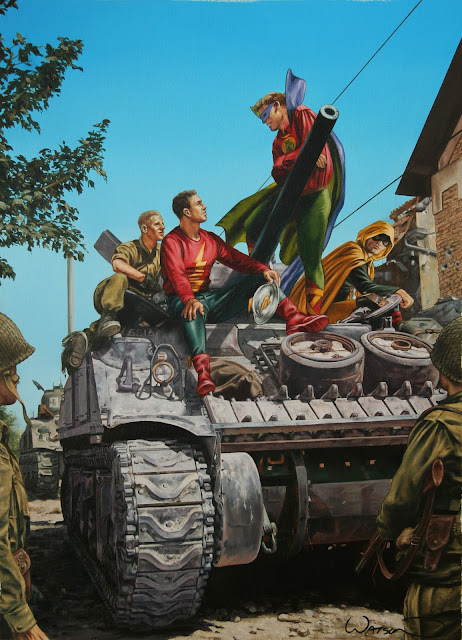
Justice Society of America on a Sherman Tank ... Part 3


Justice Society of America on a Sherman Tank ..by John Watson


And here's the final piece. It's been a while since I drew the JSA and this was a lot of fun. The figures themselves are pretty small, well smaller than I'd usually paint the main figures in a piece. But it works. I wanted this to look like a snapshot, the kind of pic that a soldier would have taken. It's more of a historical piece than a superhero pic. I think I got Green Lantern right in this one...

Friday 1 November 2013

Justice Society of America on a Sherman Tank ... Part 2


I've been enjoying painting this tank, especially the tread. Grey is interesting as it's not really grey. For example the tan, so far is a mix of Indian Red, Winsor Blue, yellow ochre, Burnt Umber, Naples Yellow and Titanium White. Stuff looks grey in relation to the colours surrounding it. It's really a mix of many colours. 

Another enjoyable aspect of working on this piece so far has been listening to the new Beatles Biography by Mark Lewisohn ...it's awesome. I've read many other books on the Beatles, Davis, Norman etc but this one is more in depth and a really great listen/read. Putting the Beatles into a historical and social context really brings it to life. Interviewing many people from the time really helps with this too, people who've previously not been heard before. 

Tuesday 29 October 2013

Justice Society of America on a Sherman Tank


Justice Society of America JSA tank John Watson


The brief was to put the JSA in a WW2 setting and include a tank, a Sherman if possible. The JSA work really well when placed in a historical or 'real' setting and so it's proving with this piece. I've gone with a bright blue sky, the same as in the photo ref I found to use. It's one of the things you don't see on comic book covers anymore, they're either metallic looking, digitally rendered and moody or full of irrelevant detail, as a generic rule. 

Also, whilst it may just look blue at this stage it's actually carefully blended so that when I add in the different elements of the foreground it'll add to illusion of depth in the painting. Basically I just made it go lighter toward to bottom.

The leaves are pretty loose, done using some dark greens, gold ochre and burnt umber...

Monday 9 September 2013

N.I.C.E. Con 2013 - Back home....


Just got back home from the Northampton International Comics Expo (NICE) at the weekend, avoided having to get on a bus as part of my train journey home only to find every train in Britain affected by a signal failure. 

Anyway, it was a great weekend. Jeff put on food for all the guests, supplied us with drinks, went beyond what a guest at a comic con expects in many ways. And his mum's vegetable samosas were awesome (ask Esad Ribic). 

One idea that Jeff introduced was to have an area set aside where attendees could queue for a free sketch by one of four artists. Whichever artist was free when the attendee reached the front of the queue was the one you got a sketch from. I was a little apprehensive at first as I like people to get on my sketch list and leave me to it (I can't really talk and draw at the same time...and I feel pressure wen people watch me)...but it was really good. Each set of artists were there for an hour and then were replaced by the next wave of artists. It was a really good idea as people who couldn't afford to pay for sketches, or kids, could get something nice to take home.

I sketch for free anyway but I'm very slow and so my list fills up pretty quickly. Sorry to all the people who didn't make it onto the list this time. If you want to get on the sketch list at any future cons I attend then just get in touch. Also, I do pre-done sketches that I sell, they're more finished. Again, get in touch beforehand and I can get one done and bring it to the con. Just don't leave it too late.

I didn't see anything at the con as I was sketching all weekend but people were really positive about it. It'll be on again next year and will be even better, no doubt. Jeff and Bub are great guys, the staff are too. They go out of their way to get guests that are new to the UK as well as some top talent from here. 

I'll be there in 2014, I have a couple of people on my sketch list already...


Thursday 1 August 2013

N.I.C.E. Northampton International Comics Expo 2013


N.I.C.E. Northampton International Comics Expo 2013 (7th & 8th September)

I'll be signing, sketching and generally hanging around at the NICE con in Sept this year. Last year was really good, a lot of guests. The venue will be better this year too, more central. I think there are 36 artists and writers attending this year. Come on down and say hi!

I'll be sketching for free at the con but be sure to get in touch, I'll be limited to 10 a day as I'm slow and can't talk and draw at the same time really. 

I'll also be doing the usual pre done sketches in Copic marker that I'll have for sale. If you'd like one drawing specifically, again, get in touch. See examples of some previous sketches here.

Tuesday 23 July 2013

Superman / The Flash Race


This is a commission I was asked to do a while ago. I was out of my comfort zone having never painted The Flash (and Superman only once) and having the scene set in outer space. Initially the hardest thing to do was get the uniforms right as every artist seems to draw the uniforms a different way. I eventually asked for reference of how the client would like it to look. 

I thought it may have looked cool to use a Star Trek warp speed effect to show the speed but t doesn't quite work when using red as the main colour...so I painted that out and left it for a while. Usually, as you can see from the earlier Spidey post, I don't do much in the way of layering but I found that the best way to create movement on this piece was to loosen up and use broader strokes. Also, purple came in handy as a bridging colour between the reds and blues. 

I was still struggling to get the piece to work as a whole, the Flash was moving and Superman wasn't...the answer to the problem was found by leafing through a Drew Struzan book...lightning (Back to the Future posters, genius...if you haven't seen them, check them out


There was already lightning on the Flash as it's part of his new uniform and adding it to Superman solved the problem. I think it looks pretty nifty now. It brought the whole piece together.

Too often when I draw, especially for published pieces, I tend to stick as closely as possible to the current version of the uniform/look of the character, even if it's a pain or I struggle with making it work in paint. Really I should just do what works. Like adding the lightning to Superman...it shouldn't be there...but it's right!

Another thing I often/pretty much always do, is paint without thinking or visualising what the finished piece will look like. An advantage is that it helps keep my interest in the art...but I do run into problems. Right now I'm painting a JSA/Crime Syndicate piece and I've painted in a really blue L.A. sky...will that work with the ref shots and the lighting I've used for the characters? Possibly. Maybe I should have thought about it. It's also why, if you ever get a piece from me, the art is never centered on the canvas board/piece of paper...

Thursday 18 July 2013

Quicksilver - Son of M #2


Initially I painted this piece in monochrome, in blue. The editor, Tom Brevoort, asked me to put in a broader range of colours. He was right. It was pretty simple, I added a touch of grey to the white parts of the costume and a few hints of skin tone. I did this back in the time when I was freelance and was working for both Marvel and DC. It was ace...

Quiksilver's uniform was a little odd at this time, the two tones of blue, the pointy gloves. The Son of M series itself was pretty cool though. The follow up, Silent War went through a lot of editorial changes, rewrites...and the final series 'Black Bolt:Underworld' was never published. I read the first issue script by David Hine, it was really good. I think the idea was to take The Inhumans to the bottom, the depths of despair and then build them up again and put a fresh version back in the Marvel Universe...but Secret Invasion happened and Black Bolt was needed for that...


Wednesday 17 July 2013

Back Issue #68 - Legion of Superheroes Special

In the September issue of Back Issue Magazine, #68, there'll be a gallery of some of my Legion of Superheroes based cover recreations and also some tonal drawings. It's an all Legion issue, if you're a fan of the team be sure to check it out!


Thursday 11 July 2013

Valiant comics

I've started working on some covers for Valiant, here's a preview of the the first one. I can't show anymore of it right now until it's solicited. It's fun doing painted covers again.

Armstrong and Archer cover preview John Watson

Monday 10 June 2013

Quicksilver - Son of M #1


This was my first cover for Marvel. The concept for the cover was by David Hine, the writer of the Son of M series. I used a model for Quicksilver who was younger than he's supposed to be in the comics because adding white hair to anyone in their late 20's makes them look a heck of a lot older. The background is from a photo I took in New York from the back of a car. I was over there to sign a lot of lithos for Dynamic Forces (Now Dynamite Entertainment) and Nick Barrucci was kind enough to let me spend a day visiting DC and Marvel...so anyway, I took a fair few photos that I've used in pieces of art ever since.

The collection of people whizzing past in the background (the idea is to show that Quicksilver has gone from the fastest man about to having the world pass him by, he's lost all purpose and his powers. He's slow!) are friends who just happened to be around at the time. The bike is mine. I kept the painting pretty loose on the Quicksilver figure as he was basically homeless at this point. I took ref shots all over the place. As long as the light source is from basically the same direction then it's ok...


Sunday 2 June 2013

Green Goblin, Spidey and a Bridge - Part 3 - Finished!


Spidey without his webbing just doesn't look right. May have put too much yellow in the highlights, we'll see when I come to do the finished. Cadmium Red, Chrome yellow, Burnt Umber are the colours I used on the red...with a little white too.

.........................................................................Now the last bit.

With the webbing I like to only use black (Mars Black) in the shadow areas. Over the midtones I add some red and over the highlighted areas the webbing is actually an orangey colour. I think it adds depth to the figure, helps to make it look more three dimensional. I ended up having to rework the eyes a bit, add more blue and brown into the darker areas of them. Also, the explosion was too unsaturated. All I did there was add some darker greys to it and it popped into the foreground.


When finished and dry I add a layer of Liquin over the painting, it gets rid of the dull spots that can appear in the dark areas and also protects the painting acting as a quick varnish.

That's it.

Spiderman and the Green Goblin oil painting

Tuesday 28 May 2013

Green Goblin, Spidey & a Bridge - Part 2


The pumpkin bombs were probably the hardest thing to paint so far...I mixed the orange using Alizarin Crimson and Indian yellow with a touch of Gold Ochre and white. I didn't want to use a red that was too saturated as I still have Spidey's costume to paint...Still need to think about depth. The glider was done without reference, like the bombs...these things obviously aren't everyday objects. The explosion was done using pretty much the same palette, Alizarin Crimson, Paynes Grey, Indian yellow and Titanium White. I just started painting it without a plan and it came out pretty well. 

One great thing that happened to me at this stage of the painting is Mike Collins introducing me to the joys of Audible.com...I like to listen to something whilst I work (or have DVD's on in the background) and audiobooks, always unabridged, are just the thing. Previously I had one set of audiobooks that I converted from cassette onto CD, the Warlord trilogy by Bernard Cornwell, but it disappeared when my last laptop died suddenly...and I must have listened to it 20 times...so to sum up, Audible, great.


Now we get to the more exciting parts. I started painting the green, starting with the ear...I always start with the ear or left eye for some reason. I like to use Sap Green, a nice rich colour but one that has a lot of oil in it. As a result it's quite translucent, like Indian yellow (which I also used here) so I put some Gold Ochre in there to thicken it up. For the darker tones I added some Winsor Blue and Burnt Umber...and then the highlights were where I threw in the white also. I find if I use white in the mix too soon then it washes out the colour too much. 

The Goblin's hat and tunic is a difficult one. In the past I used to do it in more of a purple...but, and we're talking the proper version of the Goblin here...not the post clone one...there's actually a lot more Magenta/pink to it. So, I used Alizarin Crimson with some Old Holland's Oil Mangan Violet-Blauwachtig for the base colour. Darks were done with Winsor Blue and Burnt Umber, the highlights I added white. 

To get a smooth finish I use a fan brush. If you delicately brush the paint from one tone to another it smoothes out the gradation nicely. Also, when doing highlights if you add a lighter colour then use the fan brush and repeat over and over it makes a pretty convincing shiny lycra/spandex costume.


This is painted using Winsor Blue (red shade) and Burnt Umber with Titanium White. I actually add some of the brown into the midtone too as it makes a more realistic looking blue than just using the blue straight out of the tube. I like to mix every colour I use, very rarely using it straight out of a tube, but this means I have to paint everything I'm using that colour for in one day as it's hard to replicate the exact colour again.

Using a slight outline on the figures makes them pop out of the background and create depth in the painting. Often it's just a very thin line as it just looks unrealistic if it's too thick. It's a technique that Norman Rockwell used brilliantly. I had to go back at this stage and make parts of the glider darker too as it was too similar in tone to the sky. At this point the bridge has really receded into the background. All the detail is there, which makes the piece seem realistic, but it's incidental to the action in the foreground now...which is a good thing.


Monday 20 May 2013

Green Goblin, Spidey and a Bridge


Here's the first photos of a piece I'm working on at the moment. 


Decided to paint the clouds in oil so they look more realistic. If there's no sky I usually paint buildings (or in the is case a bridge) in acrylic, it's much easier as the drying time is minutes instead of days. As there's a lot of masking off to get the straight edges this makes sense. 

But here, as the sky is done in oil, I can't put acrylic over the top. It won't work...so the bridge will have to be in oil too. 


This took a long while (due to the aforementioned masking off and drying time). Once the figures are painted in then the depth will start to appear. After I painted the sky I pencilled in the figures fully and then put a layer of liquin over the top to seal it and stop the pencil smudging the oil colour. 

I've used a limited pallette so far, yellow ochre, Payne's grey, titanium white and Naples yellow. Pretty much the same colours I used for the sky except I put a little Winsor Blue in there too.

The smoke trail for the Goblin's glider is the same colour base but with a little Alizarin Crimson added. 

Saturday 11 May 2013

Bristol Comic Expo 2013

Sketching, signing and selling art at the Bristol Expo this weekend.


For pity's sake, come along and say hi!

Sunday 5 May 2013

A table too far...


This is the latest tonal commission I've done. The fourth in a series, each depicting The Legion of a different era. The basis for the layout came from an Alex Toth marker piece I saw. I like drawing heroes sat around but this series almost changed that...I enjoyed drawing each one less as the repetition increased. I originally intended to do the Coipel Legion and then the Kitson Legion to finish with but I think 4 is enough!

Everyone has a favourite version of the Legion, or rather each version of a particular character. I guess a lot of mine are from the Cockrum/Grell era.
1960s
1970s


1980s

1990s


Thursday 2 May 2013

John Watson Art Commissions

Commissions! Here's a breakdown of what I can do, if anyone is interested: I know, the prices are a mix of English and American...but it's how I get my head round it. I'm inept at the business side to be frank. A currency converter is all that's needed...I take Paypal, Cheque, Bank transfer. And at comic conventions I take cash too (see the recently added convention sketch section after Paintings and Cover recreations!)

PAINTINGS 
I paint in oil on canvas board. I can work to specific size requirements but the usual size is approx 18" by 13". I used to paint on stretched canvas but various postal services seem to enjoy bending the art and trying their best to damage it. 

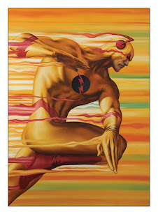
Below are a couple of examples. The Reverse Flash piece was on a bigger board but as a single figure with a basic background, something like this would be about £1000. The Spider-Man one is an oversized piece, about 70cm square and is a good example of a crazy amount of figures. It cost £2250 and the SubMariner is an example of one at the 18" by 13", something like that, with one figure and a simple background would be £750.


COVER RECREATIONS
I enjoy doing these, especially by artists who's work I like. Straight price, $300 (about £180 or so) for the linework ones. That includes me drawing in the logo, price etc. Unless you don't want it on...The full tonal pieces are $400 (£250), they're obviously more time consuming, but they look pretty nice. Cover recreations are approximately regular comic art size 15" by 11"


CONVENTION SKETCHES

Prices are £80 for an 11" by 17" (or A3 depending on where you live) and £40 for one half the size (A4)
Get in touch if you'd like a pre-con commission sketch doing before the convention itself so I have time to fit it into my schedule/put it on my list. They're basically copic marker, pencil and ink and are  finished/detailed convention sketches. I'd like to say they're similar to what Adam Hughes (did) or Copiel does for pre-con commission sketches...but they're clearly not as good as the sketches they do (And the price reflects that!) They do look quite nice though! 

Also, I'm adding sketches with colour, by that I mean a tonal copic one but with some watercolour added in. Not really bright, but pretty nice. I'll post examples and prices as soon as I've experimented a little and figured it all out. Just wanted to mention it!

Over the last year, well since the Film and Comic con in July, I've added in film and TV sketches too. Some examples of ones done for previous conventions...I'll post more soon, these are the only ones I scanned/managed to find on the internet so far!


TONAL COPICS

I do a fair bit of this kind of work. £250/ $400 for something like the pieces below.


I occasionally get asked to do pencil pieces too, these would be on a price per job, but about £200 for a fully rendered one at traditional comic book art sizes 15" by 12"