Monday 28 April 2014

DON NEWTON: INFLUENCES CHAPTER TWO

Don Newton.

 When I first saw Newton's work it blew me away. I didn't know why at the time, I was too young. I figured it out later( ...kinda like how I saw Toth's work in Adventure Comics, the Black Canary strip. I loved it, but why? I didn't know. I do now. I'll talk about that another time) But it was different, the figures had more weight, they had a realism that was missing in a lot of comic book art.

 I grew up reading his Batman issues, inked by Alcala. I thought that was a great team, I loved the textured linework that Alcala added to the backgrounds.

  Then I saw some of his work inked by different people  for example Frank Chiaramonte. Newton's pencils came through more, it added to the depth, the movement of the figures and the use of anatomy that made the work so different.


 I loved his Captain Marvel. I read all the Shazam issues by Beck, which were great, but Newton's take was just as good despite being totally different.

 A lot of people aren't blown away by Newton's work which I just don't get. 

Look at Infinity Inc #13.

Go and buy it. It's just beautiful. And check out the first pages of issue 12, the last work he did. 


His Aquaman art, the emotion, not in the faces, but the body language, is just spot on. That's a big thing in his work, the twist of a spine, the slump of a shoulder, the upturned, angled chin that coveys a character in deep thought, searching for an answer from the past, little nuances that create the sense of realism. The characters he draws are acting, there's nothing like a stock pose or a standard 'gritted teeth' face that appears every 3 panels.


 Some of his figures were almost like studies of Renaissance sculptures or life drawings...but he managed to fit them into a sequential setting that was also strong on storytelling. The figures flowed across the panels.

There are a lot of versions of Batman that I dig, Adams, Mazzuchelli, Alan Davis, Breyfogle, Darwyn Cooke etc...but Newton's is probably my favourite. Check out his work.

 I should do that more often myself.

Thursday 24 April 2014

ADVENTURE COMICS #6: THE ONGOING TALES OF THE LEGION OF SUPER-HEROES

ADVENTURE COMICS #6

I really enjoyed the adult Legion 2 parter in Adventure 354 and 355. I know some people have commented that it restricts what you can do once you've revealed the future but I don't agree. The team can travel through time...that pretty much means that anything can still happen. And, it was cool when Chemical King was introduced o n the cover of issue 354, even though we knew one day he'd die in action...we just didn't know when. And coming the issue after the death of Ferro Lad, well, it could happen at any time...The story gave us just enough information for a glimpse into the Legion's future without making the stories leading up to that point in the future irrelevant or inevitable. It was a bold decision really, many stories of that ilk were written as 'imaginary' stories. This was part of the canon.

Of course, nothing of consequence has happened in comics as a whole since the 1980's. And the Legion themselves are stuck in a perpetual loop of revision and irrelevance. So the adult Legion storyline didn't affect the book in the short or long term anyway...it was, as it was intended to be, a nifty two parter. 

So, Adventure Comics #6. This storyline was originally slated for a Superman commission series I was working on. But it fit too well with this Legion based one. And I like the idea of Superman appearing with the Legion. It makes sense, why would he just stop hanging with the team?

I'm aware there was a time a few years back when Superman was hanging with the Legion but I haven't read it. I've set this commission series' origin point as sometime between the Great Darkness Saga and the Baxter series, before the Crisis on Infinite Earths destroyed a lot of what I liked at the time. I'm not having a go at the Crisis, I enjoyed it a lot when it came out, all the characters, Perez and Ordway on the art, Blue Beetle appearing! But, it pretty much ruined the Legion, Superboy, the inspiration for the team no longer existed. And, whilst the writers did a fine job explaining about the pocket universe and trying to explain Mon -El, Supergirl etc...well, it wasn't the same was it.

With hindsight maybe it would have been best to just have Superman as the inspiration for the team and have him join as an adult. 

So, this commission series is a continuation from that time period, pre-Crisis. 

I think the cover blurb on this one speaks for itself...


Wednesday 23 April 2014

HERITAGE AUCTIONS MAY 15-17 2014 SIGNATURE COMICS AUCTION

I've got three original cover paintings in this auction ...

2014 May 15 - 17 Comics Signature Auction - Dallas  #7093


Check out the auction, you may grab a bargain...


JSA YEAR ONE


I call this piece JSA YEAR ONE but originally it was just a piece I wanted to do as a learning exercise. I'd drawn a pencil version inbetween cover jobs for DC (I believe between my run on Hawkman and before JSA Strange Adventures). Peter Tomasi, Geoff Johns and I had been talking back and forth about doing JSA Year One. We'd worked well together previously and this would be an opportunity to team up on a bigger stage. 

The idea was for it to be fully painted, Norman Rockwell meets 1930's gangster movies, a realistic setting that always works well for the JSA, homemade uniforms, regular physiques on many of the characters, bulky maybe but not pumped up. The story would cover the time leading up to the formation of the team, explore more fully the background and personality of each member, create a definitive narrative of the teams origin that'd fit into the DCU continuity of the time. 

So I saw this piece, well at least the pencil piece, as something that may be used in the series. Geoff was needed for bigger things however...

So I continued with the original reason why I started the piece, as an educational exercise. I thought working the size, or thereabouts, that Rockwell worked would be interesting, so the piece is oversized, between 75cm and 1 metre. I traced up the pencils and painted a loose underpainting in Mars Violet (can't get that in Winsor and Newton artists range anymore). It was about 8 years until I finished the painting. 

Here's the unfinished painting.

After revisiting this I've got an inclination to do another piece but really work the way Rockwell did (build up texture initially, use the same brushes he did, take more photos until I get the right reference, use actual people instead of generic heroic looking ones etc)

As an afterward, this was the piece when I discovered that using Gold Ochre was the way to go when painting yellow, it looks a lot more realistic than using any of the actual yellows such as Cadmium or Chrome yellow.


Thursday 17 April 2014

ADVENTURE COMICS #5: THE LEGION OF CRIME FINALE

ADVENTURE COMICS #5: The Ongoing adventures of the Legion of Super-Heroes

Here's the finale of the Legion of crime story arc in the Adventure Comics series I'm doing. The original idea was to post one a month, I'll get back to doing that now. 

This is the face off between the Legion's Supergirl and the Earth 3 Ultra Girl (that'd be earth 3's version of Supergirl) and ends the first story arc. It's been an eventful one as Saturn Girl is dead and the Legion have been thrown into a sense of ongoing unease at the realisation that there's another evil version of themselves only a dimension away.


Next up, Superman gets some visitors from the future....

Wednesday 16 April 2014

KURT SCHAFFENBERGER: INFLUENCES CHAPTER ONE

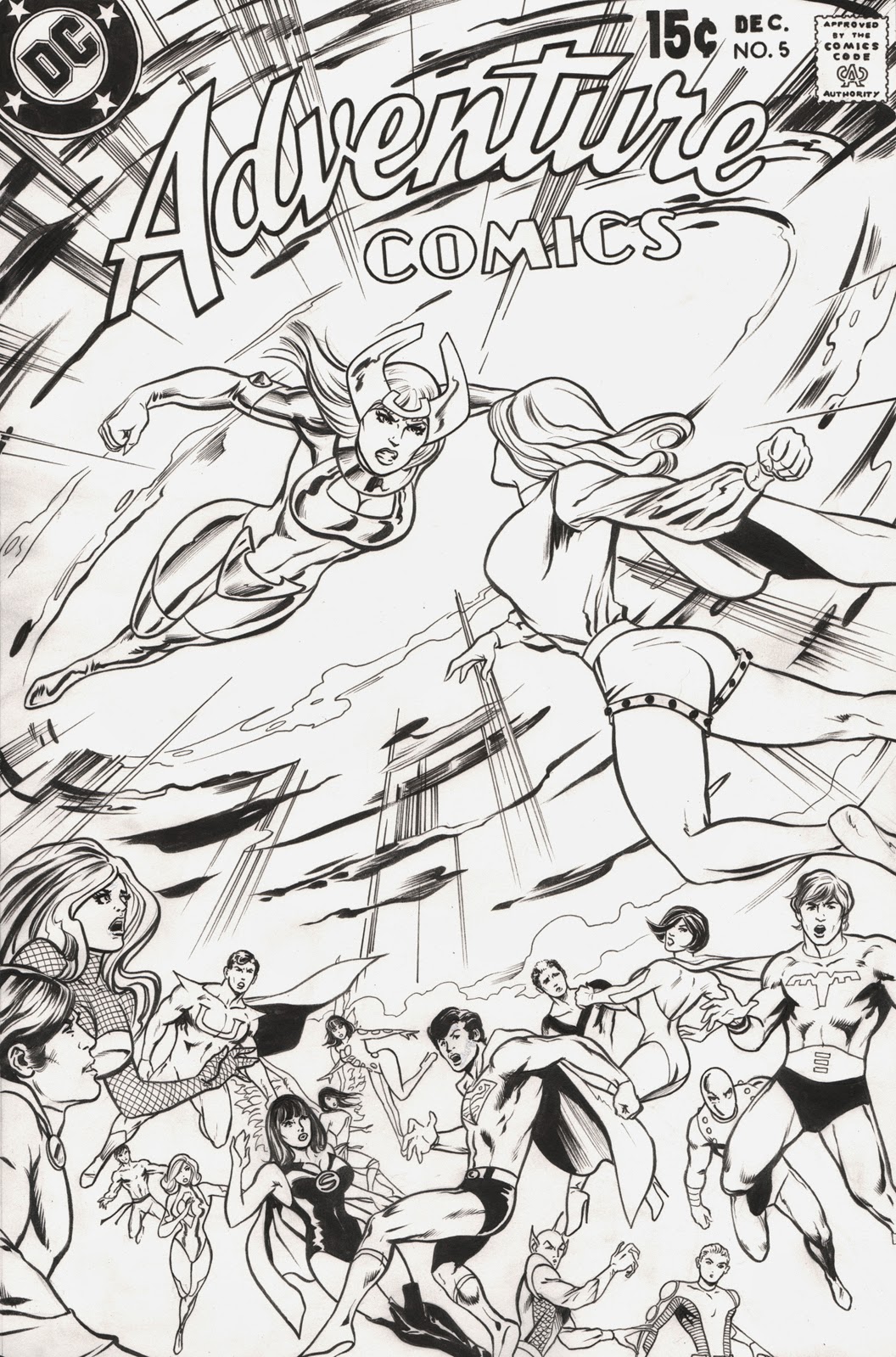
I received this piece of art in the post today from a good friend as a gift for a sketch I did.


It got me thinking about how much I loved New Adventures of Superboy as a kid. And how it influenced me, maybe not in an artistic sense, by that I mean stylistically, but in a way that it really connected with me, was something that I enjoyed immensely and ultimately played a part in me becoming an artist. 

So, this is the first in an ongoing series of posts about influences, not necessarily the obvious ones like Neal Adams, George Perez, Norman Rockwell etc (although we will get to them) but comics, TV shows, obsessions that led me to becoming a comic book artist, well illustrator really. If you discount the terrible series I drew for Dynamite Entertainment a few years back I've basically just painted or drawn covers-which I have no problem with, it's what I always wanted to do.

(I'd love to do a series of blogs about covers, the good, the bad and the unintentionally hilarious...but I'll stick to the good so as not to upset fans of artists who's covers I enjoy for all the wrong reasons)

So, New Adventures of Superboy and Kurt Schaffenberger. The art is very clean, maybe a little too simplistic for fans of contemporary comics-it isn't- just because something looks simple doesn't mean it is. A lot of artists from the early 90's didn't actually draw backgrounds, they just threw in tons of superfluous lines on the figures and hoped people wouldn't notice*-and it harks back to a simpler time. Part of this was obviously intentional, it was set in the past. The simplicity appealed to me as a kid, it may be slightly Rockwellian in setting, (the idea that Rockwell always depicted the good side of America in the 40's and 50's, he didn't, but it's the perceived view and useful to get across the point I'm trying to make about Superboy) but I liked that as a kid. It reflected my personal ideas of morality back then. 

I also saw Schaffenberger's work in Shazam but it was Superboy that really got me. 

I read maybe 98% DC as a kid, I didn't get into Marvel really until college. Superboy for a few years, was the one I always read first. 

I remember tracing the Superboy figure off issue #20 and (I don't think I've made this up) got my Dad to paint, in gouache, the same figure for me. No doubt I redrew his painting myself in the same way I drew over the top of a dinosaur painting he did for me. I guess I just wanted it to look how I wanted it to look. That's why I don't get mad when my kids draw over pieces I've drawn for them, they have an idea of how they want the art to look and it isn't how I've drawn it!


Schaffenberger was a very consistent artist, his Lois Lane looked the same for decades, you knew what you were getting. Next month's issue would have the characters looking the same, just as the characters did on Dukes of Hazzard each episode (it bothered me when Pigsy changed on Monkey). I've still not found that consistency with my art...Many artists progress, getting better and better, more mature throughout their lives (Rembrandt, Rockwell, Michelangelo etc) until their eyes or minds go, as they master their craft. That isn't really true of comic artists. A lot of them peak pretty early and then often just go downhill. Maybe they burn out. Maybe arrogance takes them...there of course is the flipside, some experiment or become something more accomplished (Sienkievitch for example) or just keep on getting better, Alan Davis, Adam Hughes. But it's very rare for an artist to show such consistency over a career, from beginning to end, Schaffenberger was one, Curt Swan another. 

Schaffenberger was great at portraying emotion too, with just a slight change in expression or body language. 
The above page is the original art for issue #43 page 18. 

One thing I don't think I'll do in this series is a history of whatever I'm talking about. I think digging for info yourself is a great way to learn. I kind of miss the old days when all you had to go off was a 1 inch reproduction of a comic cover in a price guide. Actually finding the comic itself was very exciting. The internet takes that joy away to a certain degree...it's a great tool...but people don't really use it to find out what went before. A lot of comic fans I meet never bother to learn what or who the artists they like learned from. A massive fail. As an artist it's important to look at who influenced your favourite artists so you can see where their style or technique originated from...and it's a great way to discover awesome art (or music) too.

So anyway, check out the book below for some info on Kurt Schaffenberger.

 'Hero Gets Girl!' by Mark Voger published by TwoMorrows. 

And look at the first run of Lois Lane too, it's ace. Fun stories too, a lot of them are good reads even now. I think if you enjoyed All-Star Superman you'll enjoy the original Lois Lane run.

And to Aidan, thanks very much for the piece of art! 

*Detail isn't a bad thing, look at Brian Bolland, Bernie Wrightson, Alan Davis or EC Comics for detailed comic art done properly.


Sunday 6 April 2014

N.I.C.E. 2014

NICE COMIC CON 13th/14th September 2014

http://nicecon.co.uk

I'll be sketching and signing all weekend at NICE as usual. Looks like a good guest list again! 

As I sketch for free at the con I get booked up pretty quick so come on over early to avoid disappointment. 

And, if you'd like a pre-con commission doing be sure to get in touch in plenty of time (so I can get the art finished in time, obviously). 

A4 are £40, A3 are £80, art is drawn in pencil, ink and Copic marker.

I'll also have a selection of A4 and A3 Copic pieces for sale at the con. I pretty much sold out at the recent LSCC event, which was nice.

See the link below for a couple of examples of A4 pieces done 

previously.http://johnwatsoncomicart.blogspot.co.uk/2013/12/lscc-2014.html

Also, I'll be taking part in the sketch roulette again. Despite my initial reservations it worked out really well last time. Good idea, Jeff.